


When it comes to creating a unified look for your home, choosing the right colour palette can sometimes be a daunting task. Do you opt for bright, bold colours, knowing that it might come across as too strong? Or do you stick to neutral colours at the risk of looking too boring?
Colours of all shades, tones, and brightness levels certainly have their place. But in this article, we'll talk about the hidden benefits of using neutral colours in a way that's smart, and anything but boring!
Defining Neutral
Obviously, black and white are considered to be neutral colours, along with in-between shades of grey. But it's essential to remember that neutral colours also include very dark and very light shades of brown, green, gold, red, and blue. In general, any muted colour or earth tone is considered to be neutral.
 What makes a colour "neutral" is that it is passive. It doesn't immediately catch the eye, and it doesn't make any bold statements. Neutral colours are impartial, reflecting and amplifying other colours around them.
Many people think of "beige" as the epitome of neutral colours. Certainly, there is a time and place to use beige, but a neutral palette does not automatically mean relying on beige.
Using Contrast
One of the easiest ways to showcase neutral colours is by cleverly pairing light and dark tones. For example, a room with beige walls can be paired with moulding, wallpaper, or accent pieces that use a dark neutral colour like stained wood, black, deep gold, or navy blue.
A simple decorating rule of thumb is to use neutral colours in light tones (white, grey, beige, etc.) for the background elements and neutral colours in dark tones for the anchoring pieces such as an area rug, sofa, headboard, or window treatment.
Start by picking your base neutral colour that has a dark tone. From there, pair it with lighter colour tones in the same family. For example, dark brown pairs very well with beige, taupe, and tan, or navy blue with softer shades of a lighter blue.
You can also pair your contrasting colours based on warmth. For example, a light brown is a very warm colour and would look good with other, brighter colour tones such as aqua blue and spring green. In contrast, a dark, charcoal grey would go very well with other cool colours such as lighter shades of grey or purple.
The Rule of Three
Perhaps the oldest guideline in interior design is the rule of three. When designing a colour palette, this involves choosing three different colours that match and complement one another.
For example, a clean white colour goes excellently with a cappuccino brown and a deep brown red. Together, the three colours match, each one adding a different level of contrast. Other threesome colour combinations in a neutral shade would be white, olive green, and a soft yellow or black, deep blue, and a hint of silver.

Atmosphere
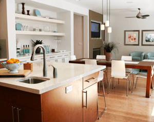
Colours greatly impact the "look" you're going for. For example, a neutral palette can be the base ingredient in a home design recipe for a rustic look. But that's not all – the palette that you choose should actually help create a specific atmosphere in the room. Spaces like kitchens and bathrooms are very different environments and, so, require a different palette to match their atmosphere.
Kitchens are rooms where there's a warm, positive, energetic atmosphere that benefits from a colour palette emphasizing this – think yellows and reds. Family rooms, however, are more for relaxing and comfort. This warm and soothing atmosphere matches a palette with deep earth tones paired with brighter whites or off-whites.
White – especially "clean" whites – evokes purity, which is why it's such a popular choice for bathrooms and laundry rooms. Dark tones evoke professionalism, seriousness, and luxury, more appropriate for a master bedroom or home office. Pops of bright colour mixed with neutral colours give off a sense of community, sharing, and warmth – an excellent choice for shared public spaces like a living room or dining room.
Match What You Already Have
If you already own or want to use a specific statement piece to anchor a room, use a neutral palette to decorate "around" it so the eye naturally is drawn towards the focal point.
For statement pieces that are very bold such as a gilded mirror or large piece of statuary, decorating with neutral colours are a great way to help tone down the overall look while subtly reinforcing it. Soft earth tones and very pale shades of colour will help infuse space and a soft energy to the room, helping to ground your statement piece.
For statement pieces that need a little work such as a vintage dresser or another piece of upcycled furniture, use neutral colours to help add emphasis to your focal point. A palette that comes across as bland or forgettable will work as a backdrop for your signature piece, helping it to stand out.
Repeating Motifs
Aiming for harmony in a room is a design idea for an upscale look, and going neutral is a great way to create a unified look. To achieve this, pick one colour and then use different shades of the same colour throughout the room.
For example, a kitchen where the walls are beige would harmonize excellently with wooden cabinets in a darker shade, a backsplash in a lighter shade, and stainless steel light fixtures and appliances. A bathroom with a blue motif could have darker blue tiles on the wall, white flooring, and light blue towels, toothbrush holder, and soap dish.
If you're interested in creating a timeless, classic look for your home, a neutral palette can be a powerful tool. Instead of creating a space that looks and feels monotonous, use neutral colours to add light, atmosphere, and a pleasing symmetry to your home.
